
Interface-Ready Color
Enough range for states, not three brand colors.
A customer sees the marketing site once and the product every working day. SaaS branding therefore has to work inside an interface — where color has to carry meaning, contrast has to be accessible, and a brand palette designed for a hero image becomes actively unusable.
A brand that only works on a marketing page is a brand your customers barely see.
Enough range for states, not three brand colors.
Because the product is used all day.
Error and success are not brand decisions.
At interface sizes, not display sizes.
Marketing and product sharing tokens.
A software brand is unusual in that most of it is encountered inside the product rather than in marketing. Interface copy, empty states and error messages are read far more often than any campaign, which changes what is worth checking.
State colors are the row most often missed. When the brand accent is also the success color, users cannot distinguish a confirmation from a decorative element, and the interface loses a signal it needs more than it needs consistency.
Four things a marketing-only identity does not provide.
Discuss Your Brand →Tints and shades for surfaces, borders and states.
Text on every background, meeting contrast requirements.
Success and error colors distinct from brand colors.
Which most products now need and most palettes do not support.
An identity that works in the product and on the site.
The design system itself is covered by design systems services. The component layer it feeds is design systems; the product interface it has to work inside is SaaS UX design. The component layer it feeds is design systems; the product interface it has to work inside is SaaS UX design.
Start from what the interface needs, then extend outward to marketing.
What colors and states the product requires.
A full range with accessible pairings.
States that do not depend on brand colors.
For a favicon and an app bar as much as a website.
From the same tokens.
How the software is sold determines what the brand has to do. Self-serve products are judged in seconds by a stranger; enterprise products are judged over months by a committee. The same identity cannot be optimized for both without deciding which leads.
Where the website has to explain the category, the value and the pricing without a conversation, and the product itself continues the persuasion. Clarity outperforms distinctiveness here, because a visitor who does not understand what the software does leaves before aesthetics register.
Where the brand is doing risk reduction for a buying committee that includes people who will never use the product. Security, continuity and credibility carry more weight than personality, and much of the work overlaps with B2B branding.
An audience unusually resistant to marketing language and unusually attentive to documentation quality. The brand is largely established through the docs, the API design and the error messages, which means voice work in the product matters more than anything on the marketing site.
Where the buyer is a practitioner in a specific industry and expects the vocabulary of that industry used correctly. Generic software branding reads as an outsider, and getting the terminology wrong costs credibility faster than any visual weakness.
Where the architecture question dominates: whether modules are named products or features. Naming a feature as a product creates a marketing obligation to sustain it; naming a product as a feature buries something the business needs to sell separately.
An interface needs dozens of values, and a marketing palette supplies three.
Surface colors at several levels, border colors, text colors at two or three weights, hover and active states, disabled states, focus indicators, and semantic colors for success, warning and error.
A brand palette of three colors plus black and white cannot supply that, so the engineering team invents the missing values ad hoc — and they diverge across features.
Supplying a full range at the branding stage prevents that, and it is a small amount of extra work at the point the palette is being decided.
Because error and success need to be unambiguous, and tying them to brand colors makes them ambiguous. A product whose brand color is red cannot use red for errors.
Users read these colors by convention, and a brand-driven deviation costs comprehension for a gain that nobody notices.
Defining them as a separate set, derived for accessibility rather than for brand consistency, avoids the argument entirely.
A customer sees the marketing site a handful of times and the application every working day. In aggregate, almost all of a software brand’s impressions happen inside the product — in button labels, empty states, confirmation messages and the wording of errors. Yet brand projects routinely stop at the marketing boundary, which means the majority of the surface is left to whoever built each feature.
The consequence is a specific and common inconsistency: a marketing site written in a warm, confident voice and a product that speaks in the flat register of database fields. The customer experiences this as a company that promised one thing and delivered another, even though nothing about the product is defective.
Extending the brand into the product does not require redesigning it. It requires deciding how the software addresses the user, what it calls the things it does, and how it behaves when something fails — then documenting those decisions where engineers will encounter them. That last part is what makes it stick, which is why product voice belongs alongside the design system rather than in a separate brand document nobody in engineering reads.
Software is frequently sold into a problem the buyer has not named. They know the symptom — a process that takes too long, information in too many places — but not that a category of tools addresses it. A brand that leads with differentiation in this situation fails, because differentiation only means something to someone who already knows what the alternatives are.
The sequence that works is category before position. State plainly what the software is and what it replaces, then say why this one. Companies with confident brands often invert this, opening with a distinctive claim and explaining the category three sections later, by which point a visitor who did not already know has left.
The tension is that stating the category plainly feels generic to the team, who have said it a thousand times. It is not generic to a first-time visitor, who has said it never. This is the single most common way a well-executed software brand underperforms: the company optimized the first screen for the audience that already understood it.
Software buyers are assessing risk: whether their data is safe, whether the vendor will exist next year, whether the product will do what was demonstrated. Brands respond to this with uptime figures, customer counts and security assurances, and a large proportion of those are stated without any way for a buyer to verify them.
The more durable approach is to communicate the same things through evidence that can be checked. A published status page demonstrates reliability more convincingly than a percentage in a footer. A named compliance certification, where genuinely held, is verifiable. Documentation depth signals that the product is mature in a way no adjective does.
Where a signal does not yet exist, the honest option is to omit it rather than approximate it. A figure that cannot be substantiated is a liability in exactly the sales conversations that matter most, because enterprise procurement asks for evidence as a matter of routine. Any uptime, customer or performance figure used publicly must have a verifiable source behind it — VALIDATION REQUIRED.

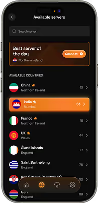
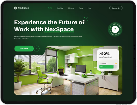
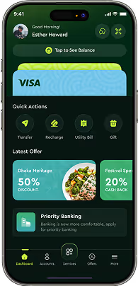

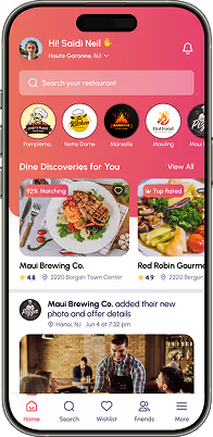
SaaS branding builds an identity that works inside a software product as well as on a marketing site — a full interface palette, accessible pairings, separated semantic colors and type that works at small sizes.
Because an interface needs dozens of values — surfaces, borders, states, semantics — and a marketing palette supplies three. The engineering team then invents the rest, inconsistently.
No. Users read success and error by convention, and tying them to brand colors creates ambiguity. Define them as a separate accessible set.
Most products now do, and it should be designed rather than derived by inverting the light palette, which produces poor contrast and muddy colors.
Branding defines the tokens; a design system turns them into components. Doing them together avoids the palette being reinvented at implementation.
They should be recognisably the same brand and they should not be the same design. The site is persuading a stranger and can afford large type, generous space and imagery. The product is being used repeatedly by someone who already decided, and needs density, restraint and fast scanning. Shared palette, type and voice carry the continuity; layout and information density legitimately differ.
By separating where each is addressed rather than by averaging the two. Marketing pages, pricing and security material speak to the buyer, who is evaluating risk and return. Onboarding, documentation and the product speak to the user, who is evaluating whether this makes their work easier. Attempting to satisfy both in the same copy usually produces something that persuades neither.
Usually not, and the default should be against it. Each separate brand needs its own recognition built from nothing, which multiplies marketing cost. Separate identities make sense where products serve genuinely unrelated audiences, or where one carries risk that should not touch the others. Otherwise a clear naming architecture under one brand gets the differentiation without the duplicated investment.
Mostly through clarity rather than aesthetics. Visitors who cannot tell what the product does, who it is for, or what happens after signing up convert poorly regardless of how the page looks. The brand contributions that move this are a plain category statement, consistent terminology between the site and the product, and onboarding that continues the promise the site made. Any specific conversion figure would require your own analytics to substantiate — VALIDATION REQUIRED.
Name only what customers need to ask for by name. Every named feature becomes a term that has to be explained, marketed and maintained, and a product with twenty named modules imposes a vocabulary on customers who wanted a tool. Descriptive labels for most things and distinctive names for the few that are genuinely sold or discussed separately is the arrangement that ages best.
Still deciding if saas branding is right for you?
Talk to UsA brand palette arrives with three colors, black, white and a couple of greys. It is well chosen, it works beautifully on the marketing site, and it is signed off.
The product needs a disabled state, three surface levels, a border color, a focus ring, and distinct treatments for success and error. None of those exist, and features ship weekly.
So each developer picks something reasonable, and eighteen months later the product contains fourteen greys, four blues that were all meant to be the brand color, and an error red that nobody chose.
Show us your product and your brand palette. We will tell you what the interface is missing and where colors have diverged.