
Product Page First
The page most buyers land on gets designed first, not last after the homepage debate.
Ecommerce website design has one honest measure: how many people who see a product finish paying. That is decided on the product page, in the filtering, and along the checkout path — not on the homepage most buyers arrive past. Ecommerce UX design is what this page is about; the build side is ecommerce development.
Store design goes wrong when it is judged as a brand exercise. It is a wayfinding and reassurance problem.
The page most buyers land on gets designed first, not last after the homepage debate.
Your actual products, prices and images — not three demo items chosen because they photograph well.
Navigation designed for your catalog size. What works at 200 products fails at 20,000.
Shipping, returns and stock shown where the doubt occurs, not buried in a footer link.
Designed for the device most purchases start on, at the connection speed they start on.
Store design has a clear job, which makes it unusually checkable. These are run on real devices with your real catalog, not on a desktop mockup.
These are design checks. Conversion rate and cart abandonment are measured in your own analytics after launch; we publish no store figures.
Four surfaces carry nearly all the revenue. Homepage is not one of them.
Discuss a Project →How people narrow a catalog to a shortlist.
Where the decision is actually made.
Where cost becomes real and doubt appears.
The shortest possible path to done.
The buying path, designed against your real range.
Layout, sorting and filtering designed for your catalog size, with facets chosen from how customers actually describe what they want.
Imagery, variants, pricing, stock, delivery and returns arranged in the order buyers ask about them rather than the order the platform outputs them.
Fewer steps, costs shown early, and reassurance placed at the moment payment is requested — within what your platform permits.
Size, color and configuration handled clearly, including what happens when a combination is out of stock.
On-site search designed as a primary path, because on larger catalogs it is how a meaningful share of buyers navigate.
Every step designed for a phone first, including the keyboard-up form states most desktop designs never consider.
Shipping cost, delivery timing, returns policy and stock status surfaced where the hesitation happens.
Tokens and components so the store stays consistent as products, categories and campaigns are added.
Design decides the experience; ecommerce development builds it, and Shopping ads send traffic to it. Product pages have their own decisions — see ecommerce product page design — and the last stretch is checkout page design.
The design that suits an impulse purchase actively harms a considered one. Purchase type decides more than sector does.
Speed is everything. Fewer steps, fewer questions, and nothing between wanting it and having bought it.
The opposite problem. People want detail, comparison and reassurance, and rushing them reads as something to be suspicious of.
The second purchase should be almost frictionless. Reorder, saved details and account access carry the value, not the storefront.
A buyer who is not the user. Delivery timing, presentation and returns matter more than specification does.
Where choices change price and availability, and the design has to keep the running total and the constraints honest at every step.
Where the decision is between your own products, and helping someone choose correctly is worth more than pushing the expensive one.
Catalog first, product page first, homepage last.
How many products, how they vary, and how customers describe what they want. This decides filtering, search and product page structure.
The page most buyers land on and where the decision is made — designed before anything else and against real products.
Category and filtering designed to feed the product page, then cart and checkout designed to close it.
Prototype tested on a phone with real people attempting a real purchase. This reliably finds things internal review does not.
Components and tokens documented, so the store stays coherent as the catalog and campaigns grow.
Design is not always what is limiting a store. These are the situations where it genuinely is.
People arrive and leave from the product page. That is usually a clarity problem — a missing answer rather than a missing discount.
Products exist that customers never reach. Filtering, category structure and internal search are design problems before they are development ones.
The desktop experience is fine and the phone one is not, which is where most of the traffic and most of the loss usually is.
Strong products presented in a template that makes them look like everyone else's.
If the issue is platform performance or product data, design work will not fix it — that is ecommerce development, and we will say so.
Abandonment has causes, and most of them are design decisions made long before checkout.
Answering the questions a buyer has, in the order they have them, without making them hunt. That is less about persuasion than about not creating doubt.
The questions are consistent across categories: what exactly is this, will it fit or suit me, what does it look like from the angles that matter, is it in stock, what will delivery cost and when will it arrive, and what happens if it is wrong. A page that answers all of those clearly outperforms a more beautiful page that leaves one unanswered.
Imagery does the heaviest lifting, and specifically imagery that shows scale, texture and context rather than the product isolated on white. The second heaviest is delivery information, which is why hiding it until checkout is such an expensive habit.
Around the attributes customers actually use to decide, not around how the business categorizes stock internally. Those are frequently different, and using the internal taxonomy is a common and quiet mistake.
Filters need to show counts, allow multiple selections, be usable on a phone, and never lead to a dead end with zero results and no way back. Sorting matters as much as filtering and gets less attention — relevance, price and newest cover most needs if relevance is genuinely good.
There is an SEO consequence worth designing for. Filter combinations can generate an enormous number of URLs, most of which nobody searches for. Deciding which filtered views should be indexable is a design-phase decision, not something to discover later.
Unexpected cost is the most cited reason, and it is a disclosure problem rather than a checkout design one. Someone who reaches checkout and discovers shipping has added a quarter to the total feels misled, and often leaves for that reason rather than the amount.
The rest are consistent: forced account creation, too many steps, missing payment methods, a slow or awkward mobile experience, and no visible answer to "what if this is wrong" at the moment payment is requested.
Almost all of that is fixed before checkout. Show shipping cost on the product page. Offer guest checkout. Support the payment methods your customers use. Put returns policy where the doubt is. By the time someone is on the checkout page, most of the damage has already been done or avoided.
It needs to be designed for mobile first, not adapted to it. Most store traffic and a large share of purchases start on a phone, and a desktop design compressed into a narrow column produces a poor buying path.
The specific differences are practical. Filtering needs a different pattern — a full-screen panel rather than a sidebar. Product imagery needs to work at thumbnail scale. Forms need appropriate keyboard types and have to remain usable with the keyboard covering half the screen. Tap targets need to be reachable one-handed.
Speed matters more here than anywhere else on the site. A store that is fast on office wifi and slow on a mobile connection loses people before they see anything that was designed.
Enough to make the decision, and no more than that. The mistake in both directions is common — either everything is crammed in, or the essentials are pushed below a large image.
The non-negotiables are the product name, a clear image, the price, availability, and the primary action. Missing any of those means a visitor has to scroll to establish whether the page is even relevant to them.
After that it depends on what people actually ask. For clothing, sizing and returns. For technical products, the one specification that decides compatibility. For anything with a lead time, when it will arrive. The right answer comes from your support inbox, not from a best-practice list.
What does not belong is the full description, the reviews and the related products. Those support a decision already in progress; putting them first delays the information that starts it.
Around the attributes people decide on, which are rarely the attributes a catalog is organized by internally.
The most useful filters are the ones that eliminate. Size, compatibility, price range and availability remove products that cannot work, and that is a faster path than browsing everything. Decorative filters that split a small range further just add clicks.
Showing counts alongside each option prevents most frustration, because it makes an empty result visible before it happens. And when a combination genuinely returns nothing, the page needs to say so and offer a route back rather than presenting a blank grid.
On mobile the whole pattern changes. A filter panel that works as a sidebar on desktop has to become something else on a phone, and it needs to show what is currently applied without the user reopening it to check.
Next to the specific doubt it answers, not collected into a band of badges at the bottom of the page where nobody hesitating will scroll to find them.
Returns policy belongs near the add-to-cart button, because that is the moment someone wonders what happens if it is wrong. Payment security belongs at payment. Delivery expectation belongs beside the price, because "when" is part of "how much is this worth to me".
Generic trust badges have limited value, particularly ones that are not clickable or verifiable. Specific statements do more work — a named returns window, a stated dispatch time, a real contact route — because they can be checked and they commit you to something.
And reassurance has to be true. A stated delivery time that the operation does not meet converts better once and costs considerably more afterwards.
Everything about the mindset. The person has already decided; the only job left is to avoid giving them a reason to reconsider.
That means removing rather than adding. Navigation, promotions, related products and anything else that offers an exit are working against the page. The order summary stays, because it answers the one question people still have.
Progress needs to be visible. Someone should always know how many steps remain, and going back to change something should not lose what they have already entered. Losing entered data is the single most reliable way to end a checkout.
On many platforms checkout is only partly yours to design — Shopify owns most of it, for good reasons. What is always yours is the cart, and everything leading to it, which is where most of the recoverable loss actually happens.
As the primary design rather than a compressed version of the desktop one. For most stores the phone is where the majority of visits happen and where the majority of the loss happens too.
Reach is the first constraint. The primary action needs to sit where a thumb naturally lands on a large phone, which is not the top of the screen. A buy button in the top-right corner is a desktop habit that survives into mobile layouts more often than it should.
Input is the second. Every field should summon the right keyboard, offer autofill where it exists, and never clear itself on a validation error. Typing a card number twice on a phone is enough to end a purchase.
And weight is the third. A product page that loads eight full-size gallery images before the price is legible will lose people on a mobile connection regardless of how good the design is. That is why image dimensions and formats are specified during design rather than left to the build.
As a primary route rather than a fallback, because on any catalog of reasonable size search does more work than navigation does.
People who use site search convert at a different rate from people who browse, and they are telling you exactly what they want in their own words. Treating the search box as a small element in a header understates what it is doing.
The results page is where most stores lose the advantage. Results that ignore stock, that cannot be filtered further, or that return nothing for a plausible synonym waste the strongest intent signal on the site.
Empty results need a designed response. A blank page ends the visit; suggestions, corrected spelling and a route back into the catalog do not. And every empty-result query is a merchandising note about something people want and cannot find.
Autocomplete does more than save typing — it shows people what you have and steers them to language the catalog recognizes. It is one of the higher-return interface investments on a large store and one of the more commonly skipped.

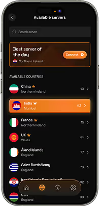
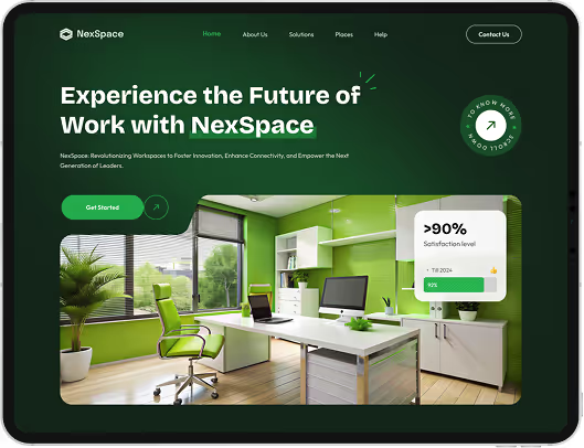
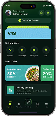

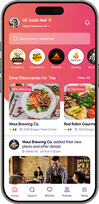
Designing the buying path — category and filtering, product pages, cart and checkout — for a real catalog, measured on completed purchases rather than on how the homepage looks.
Design decides the experience and the layout; development builds it and handles platform, integrations and performance. Most projects need both, and they are frequently bought together.
Yes, and for WooCommerce and custom platforms. Design works within each platform's constraints — checkout customization in particular is limited by platform and plan, and we design to what is actually available.
Yes, and existing stores are easier to improve because there is real behavioral data showing where people drop out. That makes the diagnosis considerably faster than designing from nothing.
Within what your platform permits — Shopify restricts checkout customization by plan, for example. What can always be improved is everything leading up to it, which is where most abandonment actually originates.
Where the project scope allows, yes — prototype usability testing on a phone with real people attempting a real purchase. It reliably finds problems internal review does not.
Filtering, sorting and on-site search become primary navigation rather than secondary features. What works at a few hundred products fails at scale, so catalog size shapes the design from the start.
We specify what imagery is needed — angles, scale, context — because it is the single largest factor in product page conversion. Producing it is separate and we will say plainly when existing photography is the limiting factor.
Mostly in discovery rather than checkout. Ecommerce UX design covers search and filtering, which affects nearly every session, while checkout affects only those that reached it.
Still deciding if ecommerce web design is right for you?
Talk to UsStore redesigns are still sold on the homepage. It leads the proposal, it dominates the kickoff meeting, and it gets the most rounds of revision. It is also a page that a large share of buyers arrive past entirely, landing on a product page from a search result or an ad.
That mismatch is why so many attractive stores underperform. The effort concentrated on the page with the least commercial responsibility, while the product page — where the decision is actually made — inherited whatever the platform template offered.
The unglamorous truth is that ecommerce design is mostly about answering questions in the right order. What is this, will it suit me, is it in stock, what will it cost to get here, and what if it is wrong. Answer those clearly and a plain page outperforms a beautiful one that leaves the buyer guessing about delivery.
So that is where we start, and the homepage gets designed last — when we know what it needs to do for the people who do land on it.
Tell us about your range and where buyers currently drop out. We will tell you which part of the buying path is costing you most.